
Gimp Tips - Stamp
This is a trick I figured out to make some text look like a bad stamp transfer. I saw a font that did this same effect but didn't really like the look of the letters (ignoring the bad transfer) so I figured out how to use the GIMP to apply that look to any font I wanted.
 First, make a background for your image. It doesn't have to be anything
fancy. A solid color works just fine.
First, make a background for your image. It doesn't have to be anything
fancy. A solid color works just fine. Make a transparent layer on top of that with your text and whatever else
you want the stamp to have. I've added a box around my text because that
just seemed sort of stamplike. Use whatever color you want the ink of
your stamp to be.
Add a layer mask to this layer, but leave it white for now.
Make a transparent layer on top of that with your text and whatever else
you want the stamp to have. I've added a box around my text because that
just seemed sort of stamplike. Use whatever color you want the ink of
your stamp to be.
Add a layer mask to this layer, but leave it white for now.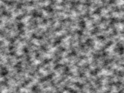 Add a new layer on top and fill it using Filters|Render|Clouds|Solid Noise.
Set both sizes to 16, and the detail level to 6.
Add a new layer on top and fill it using Filters|Render|Clouds|Solid Noise.
Set both sizes to 16, and the detail level to 6.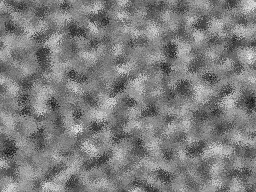 Mix it up a little with Filters|Noise|Spread at 10.
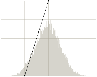 Now we'll turn this noise into a splotchy layer mask. Go to
Colors|Curves and move the lower point to (64,0) and the upper point
to (128,255).
Now we'll turn this noise into a splotchy layer mask. Go to
Colors|Curves and move the lower point to (64,0) and the upper point
to (128,255).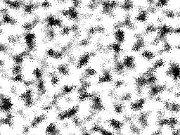 It will end up looking like this. Copy this layer and hide it.
 Go back to the layer mask we added to the stamp text and paste.
 Nobody ever stamps perfectly straight so I used the rotation tool to
tilt the stamp layer a bit, and we're done.
Nobody ever stamps perfectly straight so I used the rotation tool to
tilt the stamp layer a bit, and we're done.