
Gimp Tips - Worn Text
Worn out things seem to be popular these days. People spend absurd amounts of money to buy clothes that look old and worn out. My clothes look old and worn out. Does that make me cool? No. Because my clothes actually are old and worn out and not purchased that way.
Anyway, the worn out look has even made its way into graphic design. Sometimes it does look kind of cool. So here is a way I figured out to make something look like a worn out print on an old t-shirt. Or maybe something else that's worn out. Worn out, in any case.
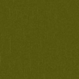 First, make a background for your image. It doesn't have to be anything
fancy. A solid color works just fine.
First, make a background for your image. It doesn't have to be anything
fancy. A solid color works just fine. Add a transparent layer on top of that and create your foreground image
on that. Add a layer mask to this layer, but leave it white for now.
Add a transparent layer on top of that and create your foreground image
on that. Add a layer mask to this layer, but leave it white for now.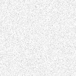 We're now going to construct a fancy layer mask to apply to that
foreground image. We'll begin by adding a little faint texture so that
the image doesn't look too perfectly uniform. Add a new white layer on top
of everything else (I'll assume you add new layers on the top for the
rest of these instructions). Add some noise to it with
Filters|Noise|RGB Noise. Set red, green, and blue to 0.3 and alpha to
0. Uncheck Independent RGB.
We're now going to construct a fancy layer mask to apply to that
foreground image. We'll begin by adding a little faint texture so that
the image doesn't look too perfectly uniform. Add a new white layer on top
of everything else (I'll assume you add new layers on the top for the
rest of these instructions). Add some noise to it with
Filters|Noise|RGB Noise. Set red, green, and blue to 0.3 and alpha to
0. Uncheck Independent RGB.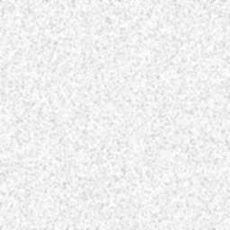 Soften it up with Filters|Blur|Blur.
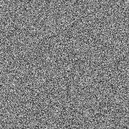 Now we'll add some vertical scratches. Add a new layer and fill it with
a medium gray (128,128,128). Do Filters|Noise|RGB Noise again, this time
with red, green, and blue at 0.5 (still 0 alpha).
Now we'll add some vertical scratches. Add a new layer and fill it with
a medium gray (128,128,128). Do Filters|Noise|RGB Noise again, this time
with red, green, and blue at 0.5 (still 0 alpha).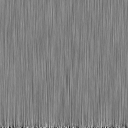 Smear that noise out vertically with Filters|Blur|Motion Blur. Choose
linear mode, length 40, angle 90.
Smear that noise out vertically with Filters|Blur|Motion Blur. Choose
linear mode, length 40, angle 90.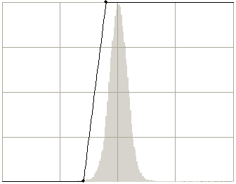 We'll reduce this to just a few random scratches with the curves tool
(Colors|Curves). Move lower point to (90,0) and the upper point to
(115,255).
We'll reduce this to just a few random scratches with the curves tool
(Colors|Curves). Move lower point to (90,0) and the upper point to
(115,255).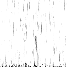 This is the result.
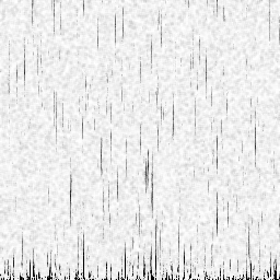 Set the layer's mode to Multiply. That will superimpose the scratches
on the noisy texture we made previously. Merge the two layers
together. We're going to do this a couple more times, adding new
effects and merging them down until we have an elaborate grayscale to
apply as a layer mask.
Set the layer's mode to Multiply. That will superimpose the scratches
on the noisy texture we made previously. Merge the two layers
together. We're going to do this a couple more times, adding new
effects and merging them down until we have an elaborate grayscale to
apply as a layer mask.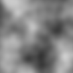 Next we'll add some blotches that are slightly discolored. Add a new
layer on top. Fill it using Filters|Render|Clouds|Solid Noise. Set both
sizes to 2, and the detail level to 2.
Next we'll add some blotches that are slightly discolored. Add a new
layer on top. Fill it using Filters|Render|Clouds|Solid Noise. Set both
sizes to 2, and the detail level to 2.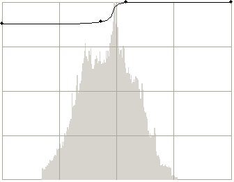 Adjust the result with Colors|Curves. Move the lower point to (0,224)
and add points at (110,227) and (138,255). It should look more or less
like this.
Adjust the result with Colors|Curves. Move the lower point to (0,224)
and add points at (110,227) and (138,255). It should look more or less
like this.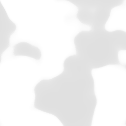 The layer will end up looking like this.
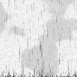 Set the layer mode to Multiply and merge it down.
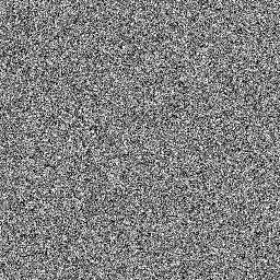 Now for the fancy part. We're going to add clusters of speckles.
Add a new layer and fill it with medium gray (128,128,128). Do
Filters|Noise|RGB Noise with red, green, and blue at 0.5 again.
Now for the fancy part. We're going to add clusters of speckles.
Add a new layer and fill it with medium gray (128,128,128). Do
Filters|Noise|RGB Noise with red, green, and blue at 0.5 again.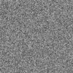 Spread it out with Filters|Blur|Blur.
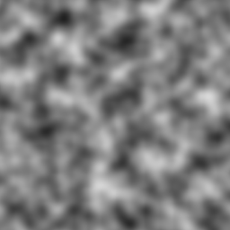 Add a new layer and fill it with Filters|Render|Clouds|Solid Noise.
This time set the sizes 8 and the detail level to 1.
Add a new layer and fill it with Filters|Render|Clouds|Solid Noise.
This time set the sizes 8 and the detail level to 1.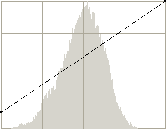 Colors|Curves, move the lower point to (0,32).
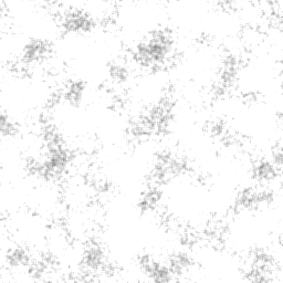 Set the layer mode to addition and merge it down.
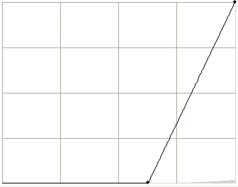 This gives us clumps of speckles, but they're too light to use.
Colors|Curves again and move the lower point to (160,0).
This gives us clumps of speckles, but they're too light to use.
Colors|Curves again and move the lower point to (160,0). This looks more useable.
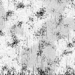 Set the layer mode to Multiply and merge it down. Now that's a nice
scuffed up layer mask. Copy this layer and then hide it.
Set the layer mode to Multiply and merge it down. Now that's a nice
scuffed up layer mask. Copy this layer and then hide it. Select the foreground layer's layer mask (that we added ages ago)
and paste.
Select the foreground layer's layer mask (that we added ages ago)
and paste.
Not too shabby. Or, actually very shabby. But in a good way.